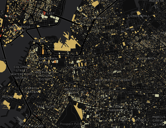
The dapmap lets you see how bad things really are in each neighborhood. Gentrification is New York’s white whale, and no amount of low-stakes ukulele songs about the issue are going to rein it in. Trying to determine who’s actually “part of the problem” is so 2015. Anti-gentrification sentiments are better put towards neighborhood engagement and community organizing to fight the thing, both of which are newly made easier with this ^^^ handy interactive gentrification map. The Displacement Project Alert Map, a project of the Association for Neighborhoods and Housing Development (ANHD), lets you see where gentrification is doing its worst in the city. It’s web-based, so it updates frequently. You can search the map by council districts, community boards or zip codes. Buildings are colored along a gradual spectrum ranging from pale yellow to dark red, the darker colored buildings indicating a higher risk of its tenants facing displacement. The ANHD’s analysis of risk is determined by three factors: Loss of rent-regulated units in the building Volume of NYC Department of Buildings… Read More
See if your neighborhood is about to be gentrified with this handy interactive map : Brokelyn


Leave a Reply
You must be logged in to post a comment.